How to Update a Historic Brand (Without Breaking Things)
When we get a packaging project, our illustrators work directly with art directors and brand managers from the agency or in-house design team to uncover little insights. This way, we’re sure our packaging design does exactly what it needs to.
Our own Von Glitschka worked with Landor and Kiwi to bring some updates to the Kiwi brand and their product updates.
With a market-leader as long-standing as Kiwi (113 years!), it was important to take things step-by-step. This started by looking at where they came from—and where they were headed to.
Lesson One: Make a map of where you’re going before you start down the road.
New packaging for a market-leader needs to do two things.
1) It must stand out on the shelves.
2) It must bridge new and old customers.
Von’s logo work took inspiration from the well-polished look of the early days (pun very much intended). But he didn’t stray too far from the version that today’s customers know.
Lesson Two: Keep it familiar.
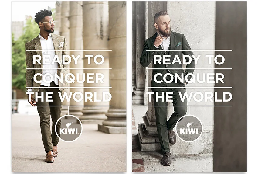
The logo update gave the kiwi bird more confidence and swagger—which was key to fitting with the brand’s positioning moving into Kiwi’s latest campaign.
Lesson Three: Make sure it works with your brands goals.
But of course the most important part for this packaging project was the… well.. packaging! The logo update needed to integrate with the design seamlessly. And that’s where our team excels.
Lesson Four: Make it stand out.
Von worked with Senior Designer Grant Collinsworth and the Landor creative team to make sure the design showed off the swagger they added, the history they honored, and the innovation they were introducing. New product packaging and product line extensions needed a bold look to stand out.


