Meg Hunt narrows down a style for WEREWOLF? THERE WOLF!

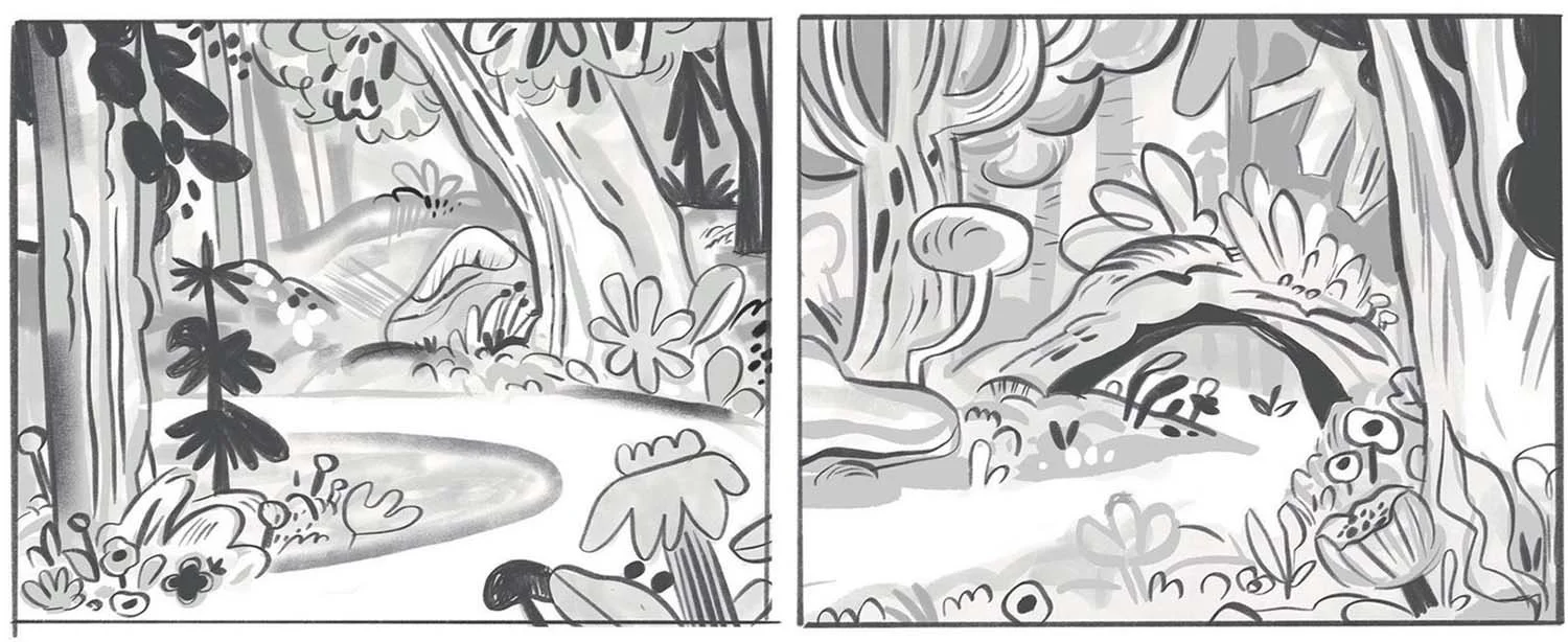
For the last leg of our tour, let’s take a peek at the world of WEREWOLF? THERE WOLF! After we got a clear sight of our main characters, it was time to do a bit of style testing (see style test images 1 & 2 below). Meg wanted to try something a bit different stylistically with this book to push herself. So after finding initial inspiration from mid-century picture book design and theater stage design, Meg found a way to make a forest that was both wild and graphic.

Meg also happened on a technique that was really satisfying to incorporate into the book. She spent a couple of days painting sheets of paper with washes of watercolor and fountain pen ink— something she hadn’t done in ages. She let colors wash and bleed together without a plan, and then manipulated their colors digitally to create a library of background flats that would be the start of any spread. (She also took inspiration from Style Test Image 1, where she’d use an overlapping color layer that she could mask into, cutting and painting to reveal the painted background below.) This helped unify things and made coloring a little simpler than previous books. The result made for a glowing, organic forest that felt alive with color.


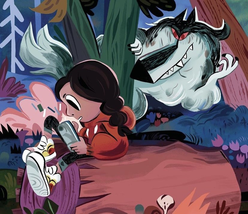
Meg said, “I loved these sketches, though lost my way a bit with color at first— trying a new process and making quick decisions meant I was still learning as I went, and after I stepped back I realized- too much color makes things busy, I’ve lost that graphic quality I wanted!!” The big takeaway: black and white were vital to ground the woods. So she tried to keep that in mind as she created the final art in Style Test Image 5.
Hope you enjoyed our little behind the scenes peek and don’t forget you can order WEREWOLF? THERE WOLF! through Hazy Dell Press.