Taking a Visual Journey with Meg Hunt
When is a crochet book more than a how-to manual? When it takes the reader on a visual journey through forests, jungles, oceans and zoos. You can learn how utilizing fun and playful graphics from illustrator Meg Hunt, was a creative way to bring the projects to life, and keep the reader engaged.
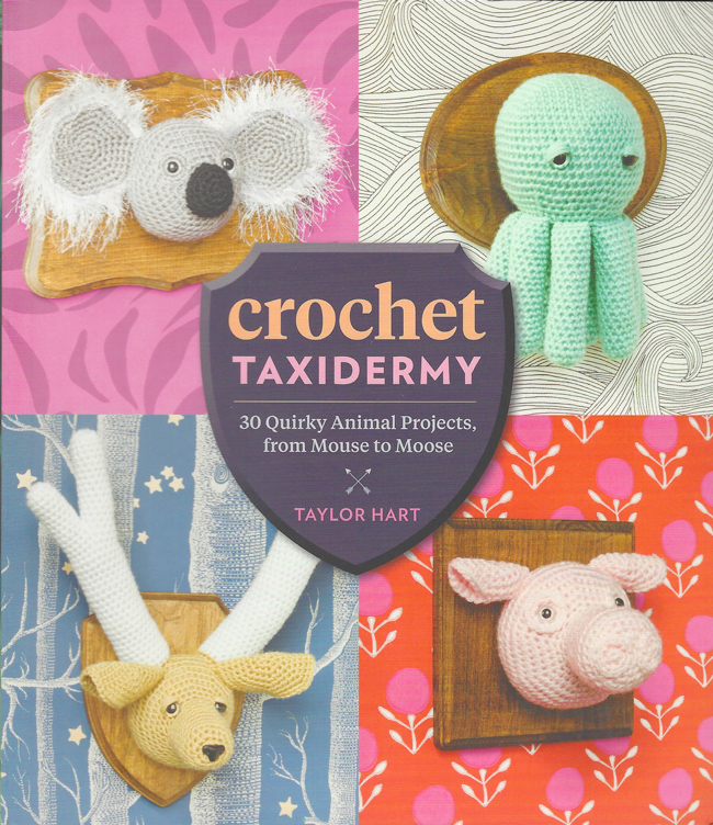
Could you walk us through the creation of the Crochet Taxidermy project? What were the client’s goals? Storey wanted a book that was playful and full of excitement for the projects within; art director Alethea Morrison had decided to group each project by a theme (such as undersea or farm) and photographed each crocheted creature with poppy wallpapers as backgrounds. Based on the aesthetic direction, Alethea asked me to design a series of openers using my limited palette style that reflected the wallpaper colors and represented all the creatures in each region.
What were some of the thoughts that fueled the direction of the art? I knew that this art would have a couple of challenges.
One, each section had a different number of creatures, and the scale varied considerably-- for example the undersea illustration had the least number of creatures, but it was dominated by the octopus. On the other side of things, the woodland scene had a considerable number of creatures, and quite a few that were very small in scale. This required me to spend a long time developing a visual direction that let each creature show up, but also balance the image.
The other creative challenge was the limited color aspect-- something that I love to work with, but don't often get to work with such complex imagery. Since each creature would be based on this palette and not its own natural coloring, it became really important to think about value and depth within the piece and how the colors I chose for the whole image could be broken down and overlapped to get a beautiful end result.
What are your favorite animals to draw? A lot of animals I love to draw because I find new ways to stylize and play with them (examples being the rhino and hippo in the safari piece and the bull in the farm piece) but I think for this project, my favorite animals were a lot of the ones that weren't as dominant: the duck in the woodland scene, the more simplified giraffe, zebras and elephant in the safari scene's background-- these were little simpler moments that had a lot of personality for me!
Beyond raw illustrative and conceptual skills, what professional and interpersonal skills do you exercise to make each project run smoothly? I try to ask as many questions as I can before I get into the meat of the project, keep on top of responses with the client and before I get into the final end results of the project make sure that the client understands the direction I'm heading. In this case, that meant very clear sketches and sample palettes. Clear communication is key to keep us both on the same page and happy about the result!
In what ways did the initial concepts differ from the finished work? Most of the original concepts stayed pretty true to the finished work in terms of composition (barring some minor tweaks for layout); however, when working with a limited palette that is designed to utilize a lot of transparent overprinting, it is always fascinating to see how you have to manipulate each color to get them all to lay down as a cohesive image. Some of the colors we opted to work with allowed for pretty straightforward choices, but sometimes things needed to be dialed back or a creature's colors needed to be swapped for the composition to feel balanced.
How would you describe the feeling you get when you know you have satisfied your client? I feel excited and proud, because I know that the work champions their interests and point of view. The harder I try to satisfy and impress the client, the more I wind up learning for future projects too.
OK Meg, what is it about your style that makes publishers want to work with you? I think that my way of working is equal parts bold and welcoming-- bold shapes, colors and textures are a definite nod to the past, but I try to make the work feel exciting and fresh, full of details to catch and delight the eye. I think my urge to keep challenging myself in terms of how and where my work to grow excites publishers.
So that's it! Check out more of Meg Hunt's work by clicking here.


