
How thoughtful illustration helped Spindrift Tea create distinctive flavor imagery while navigating packaging constraints.
The Challenge
When Sterling Brands developed the Spindrift Tea line, the brand needed flavor illustrations that would reinforce its commitment to real fruit while distinguishing the new products from its existing sparkling water packaging.
The goal was a watercolor-inspired look that felt fresh, juicy and slightly realistic, without losing the recognizable Spindrift identity.
And the artwork had to do more than look appealing. It needed to work within the technical limitations of can printing and adapt to multiple packaging formats.
The Creative Solution
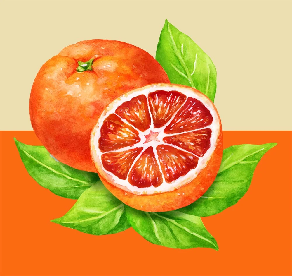
Illustrator Lisa Ballard developed vibrant, watercolor-style fruit illustrations with bright colors and white highlights that gave the ingredients a freshly washed appearance.
But achieving that natural look required careful planning.
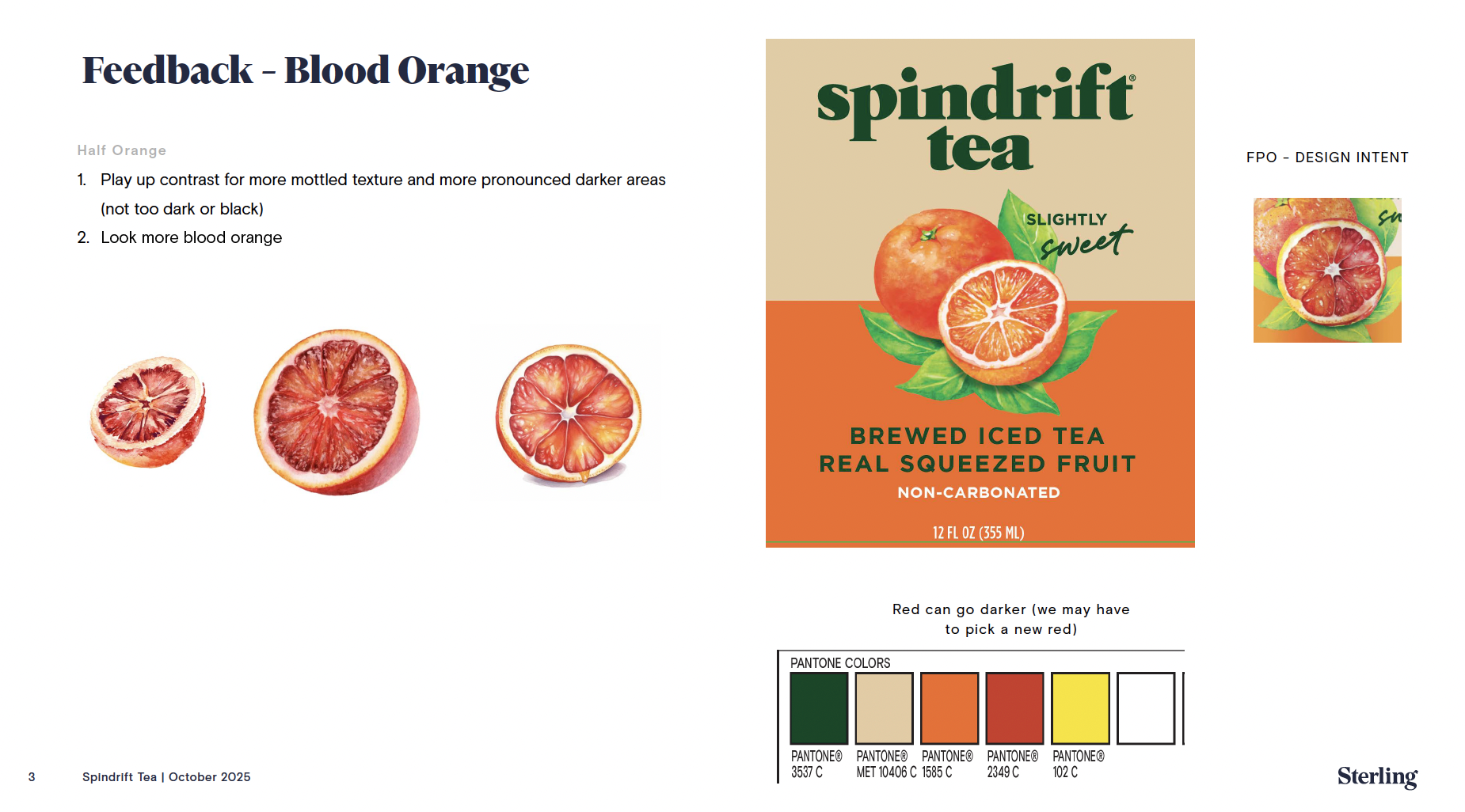
Each can was limited to six flat printing colors, including established brand colors and a flavor-specific color. Lisa had to create the appearance of dimensional, juicy fruit while working within those restrictions.
She also built the fruit and leaf illustrations as separate elements so they could be rearranged for both cans and cardboard packaging.
Throughout the process, Lisa collaborated closely with Spindrift's team, adapting the artwork to their existing visual language, incorporating feedback and making refinements without having to start over.
The Result
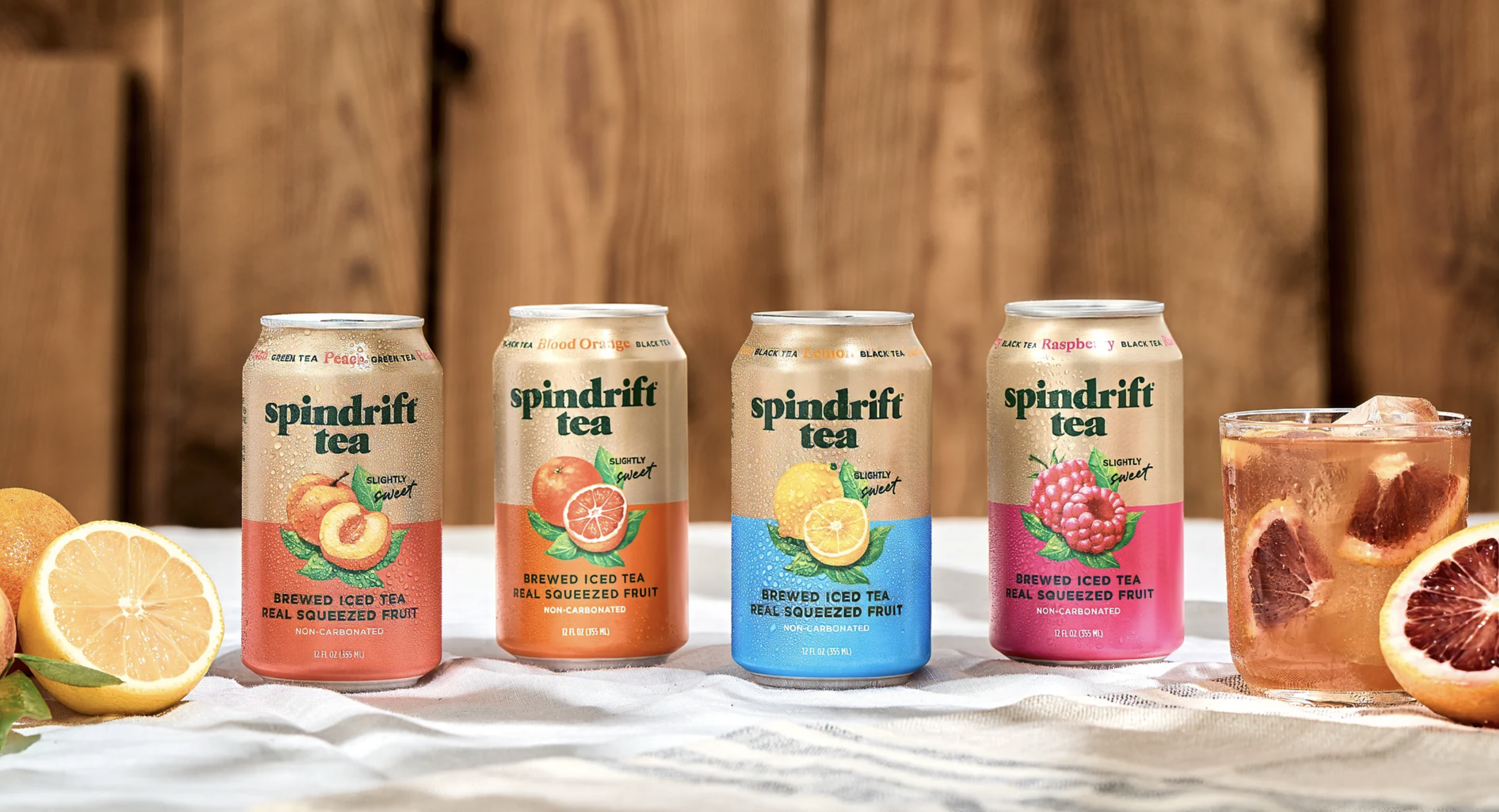
A cohesive collection of flavor illustrations that gives Spindrift Tea its own visual personality while staying connected to the larger brand.
Just as important, Lisa's experience and collaborative approach helped make a potentially complicated production process more efficient.
As Zachary Abdalian, Innovation Packaging Manager at Spindrift, explained:
"Overall, Lisa made what could have been a drawn-out, iterative process feel seamless. She's talented, flexible, and efficient, and I would absolutely welcome the opportunity to work with her again."
The project is a reminder that successful packaging illustration isn't simply about creating beautiful images. It's about understanding the brand, solving production challenges and working with the creative team to get the details right.
